Soundfun Mirai Speaker eCommerce Website
As Lead UX/UI Designer, I led the design and optimization of Mirai Speaker’s brand-owned e-commerce site ahead of its November 2023 launch — with a focus on increasing direct-to-consumer sales, clearly communicating product benefits for hard-of-hearing users, and reducing friction across the purchase journey.
Mirai Speaker’s Business Goals
Drive direct online sales through the brand site, complementing Amazon
Clearly explain a new product category built for hard-of-hearing users
Reduce customer uncertainty, returns, and post-purchase support requests
The UX Challenge
Mirai Speaker entered the market with a unique value proposition: clearer TV dialogue for hard-of-hearing users, however faced three key challenges:
Category education: Many users didn’t understand how the product differed from regular speakers which saturated the market
Limited initial visuals: Early product imagery alone couldn’t fully communicate the experience. Also since its a Japanese brand in the U.S. market, localization was key
Purchase friction: Explaining benefits, building trust while answering to critical reviews, and simplifying checkout were critical to conversion
UX Strategy
We focused on the following upon launch:
bringing the elderly / hard of hearing user needs into the forefront
highlighting the speaker’s unique curved panels tech for unique selling point
and getting users to test before they fully commit, to increase trust
My role centered on aligning UX decisions with conversion outcomes through rapid iteration, A/B testing, and close collaboration with developers and marketing teams.
Aside from UX UI support, I brought on a close Developer partner & team I’ve worked with for 4+ years, as well as coordinating content creation. I was the strategic American partner supporting a Japanese company’s expansion into the U.S. consumer market, adapting an eCommerce website through multiple iterations to customer profiles, major sales holiday like Black Friday and more — with rapid A/B testing.
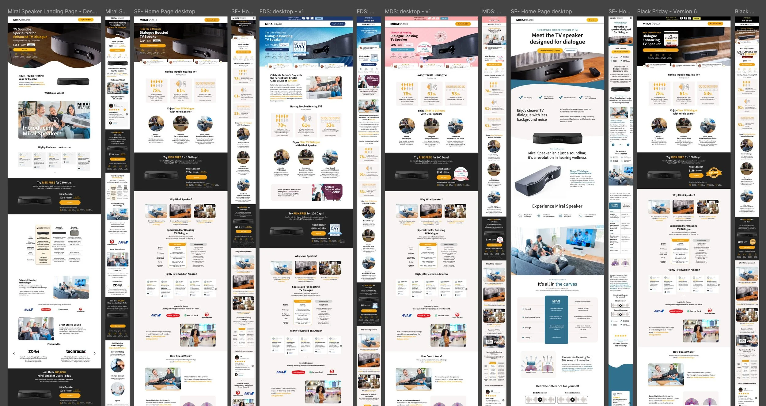
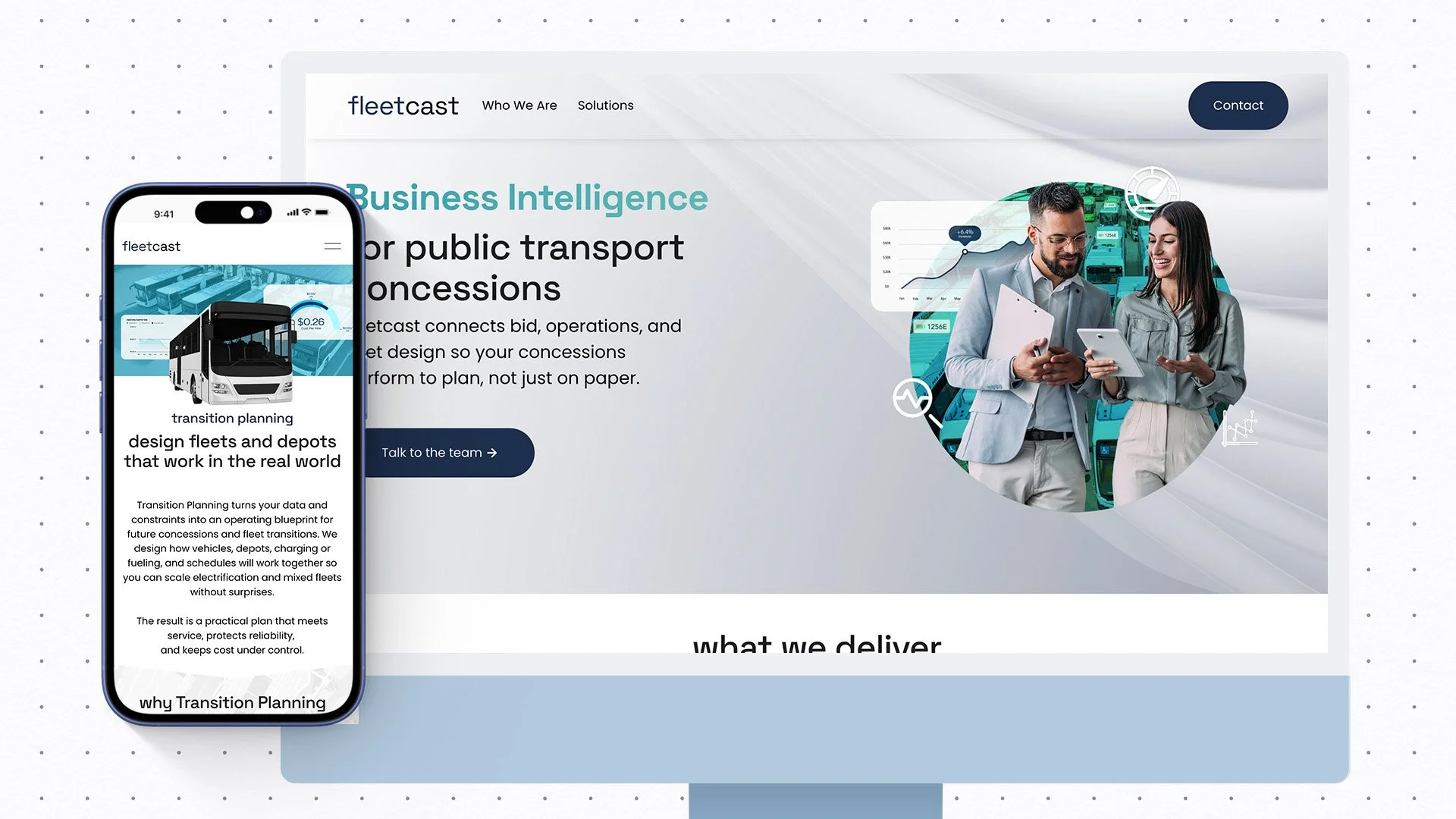
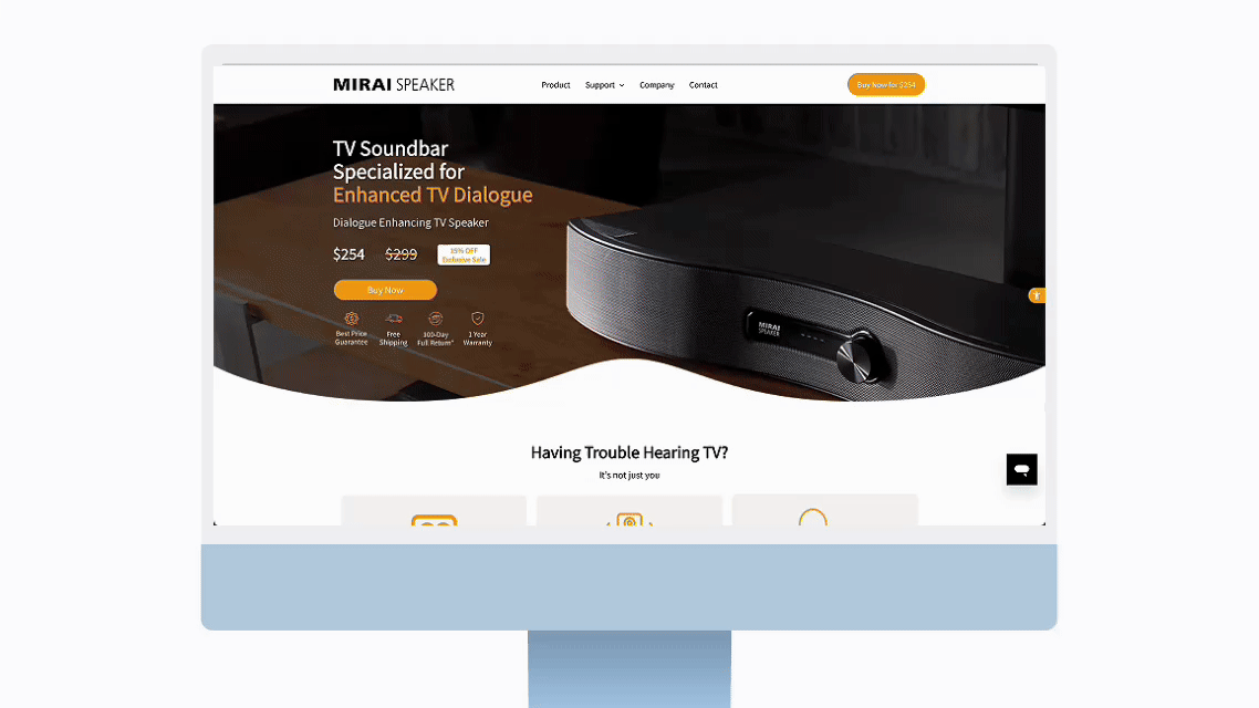
Various screens throughout the year ranging from main page, to new landing page, holiday sales and more.
System Built for Rapid Iteration to Drive Sales
Rather than treating the homepage hero as a static visual, I designed it as a flexible system built to evolve across seasons, campaigns, and market priorities.
I created multiple modular hero templates that allowed internal teams to rapidly swap messaging, imagery, and themes without redesigning the page each time. This made it possible to:
Highlight different focus areas such as technology innovation, safety, or health
Support seasonal sales periods and regional campaigns
Compare creative themes and messaging across markets
A/B test hero layouts and visual treatments to understand what resonated most with users
By designing the hero as a reusable, plug-and-play system within the CMS, the team gained the ability to respond quickly to business needs while maintaining brand consistency and UX integrity across all markets.
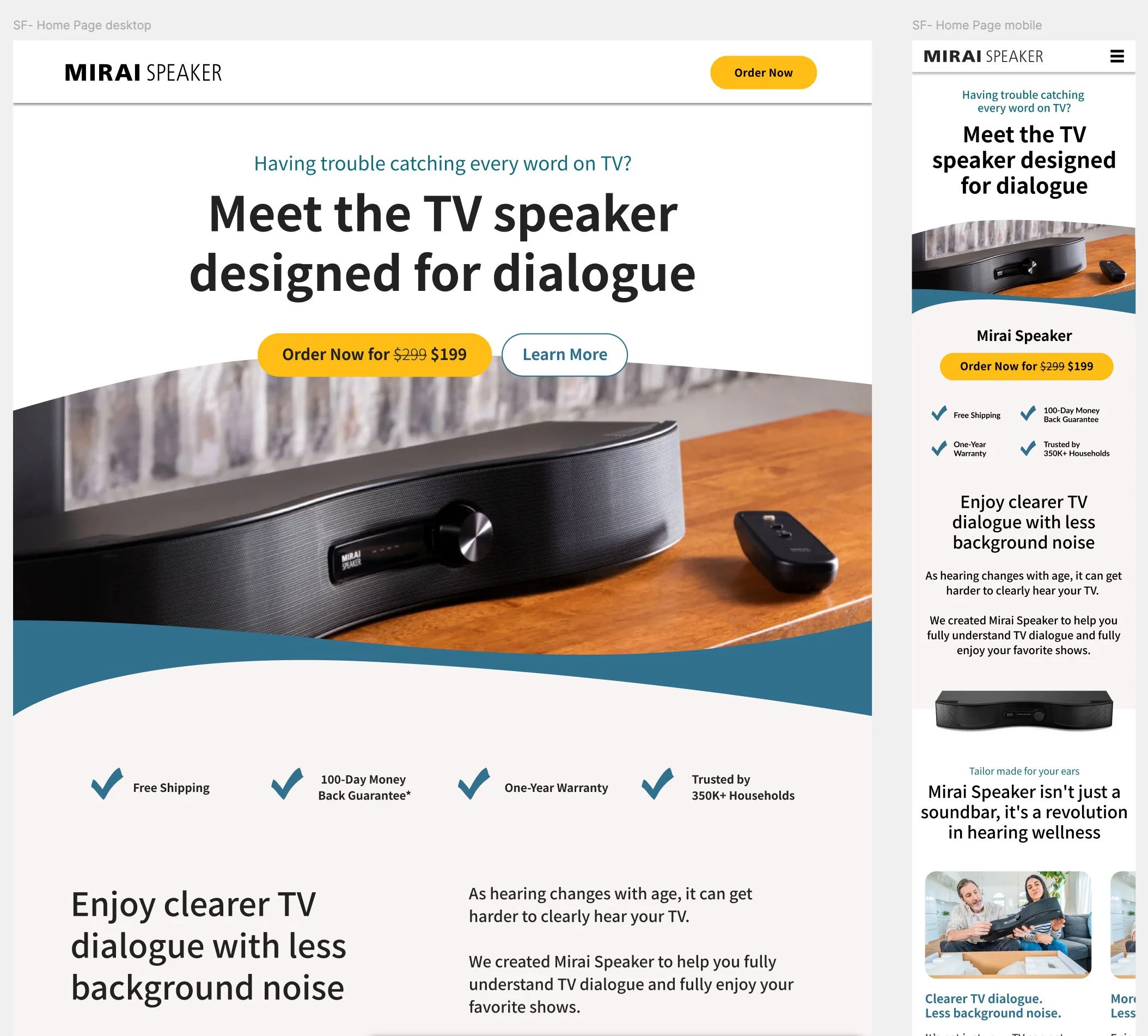
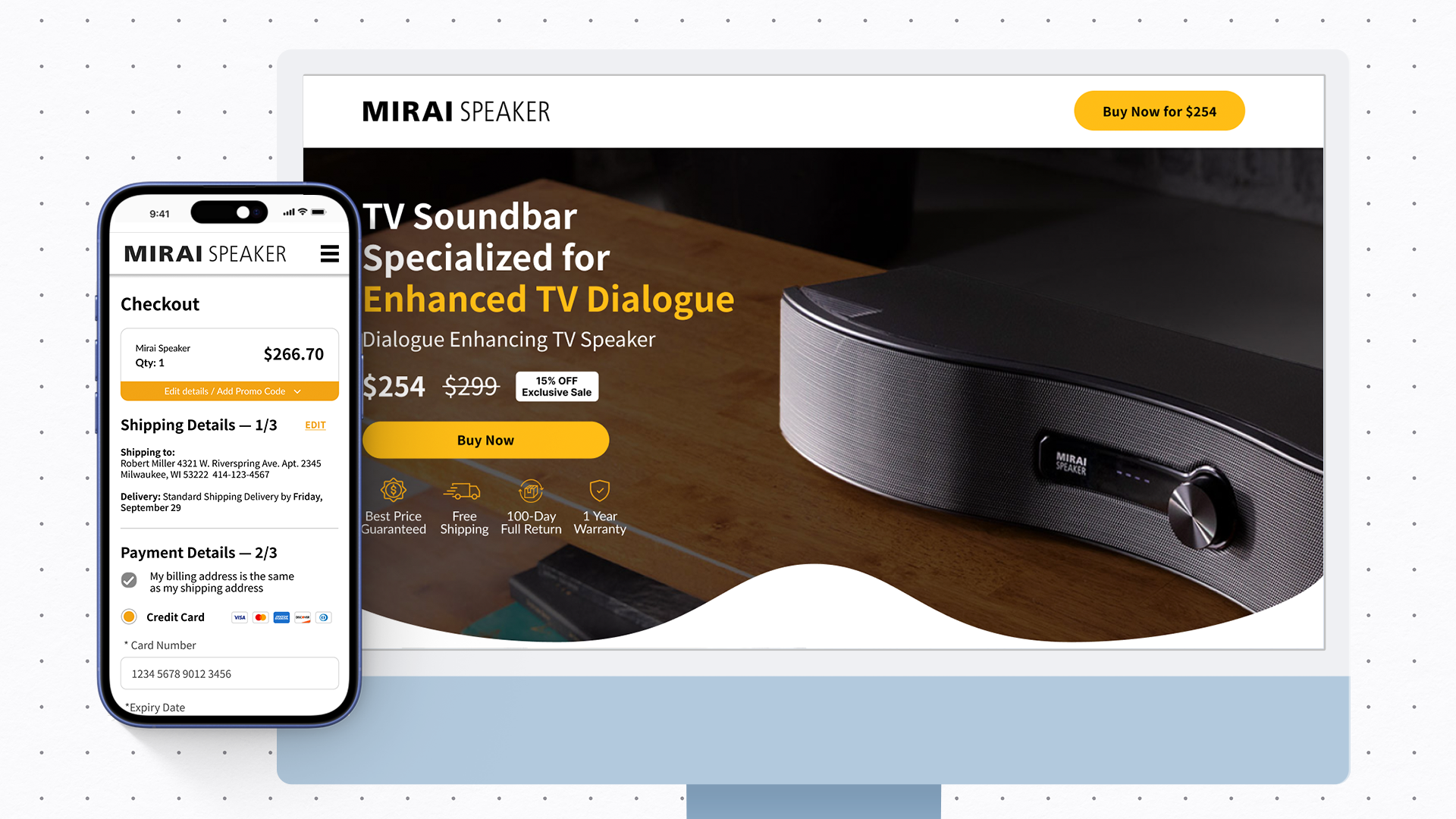
One of the latest landing pages, focused on delivering a storytelling approach. We tested “having a conversation” with the site visitor while showcasing key benefits in first-view which led to an increase in conversions.
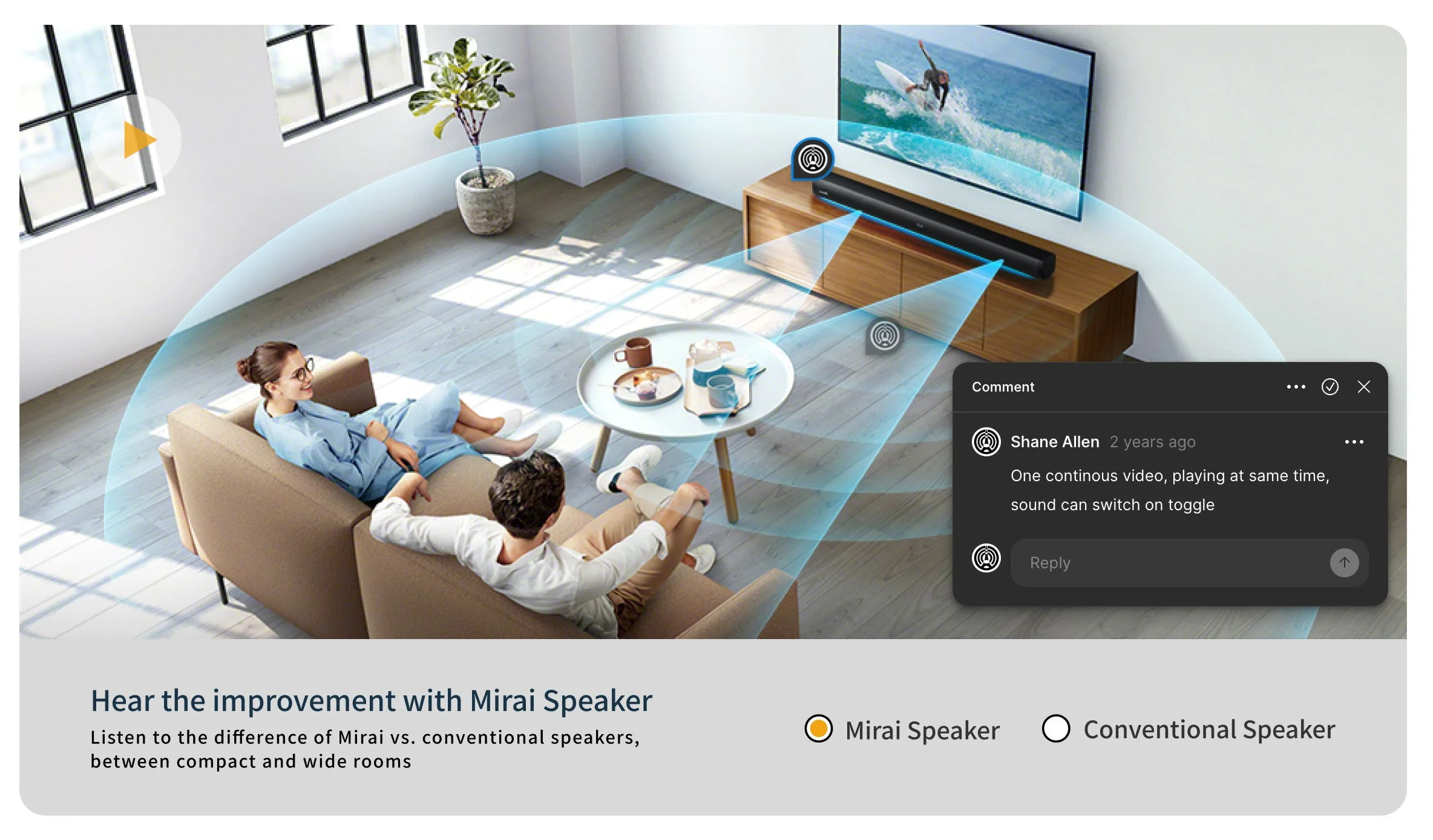
An earlier model of the sound comparison that was refined and developed over time, before addressing simplicity and page speed.
Key Feature: Interactive Sound Comparison
Making the Difference Tangible
One of the biggest conversion challenges was communicating how Mirai Speaker actually sounds compared to standard TV speakers.
I designed a custom interactive comparison feature that visually demonstrated the difference between regular TV audio and Mirai Speaker output. Built in collaboration with developers and a videographer, this interaction helped users immediately grasp the product’s benefit — and directly contributed to improved conversion rates during testing.
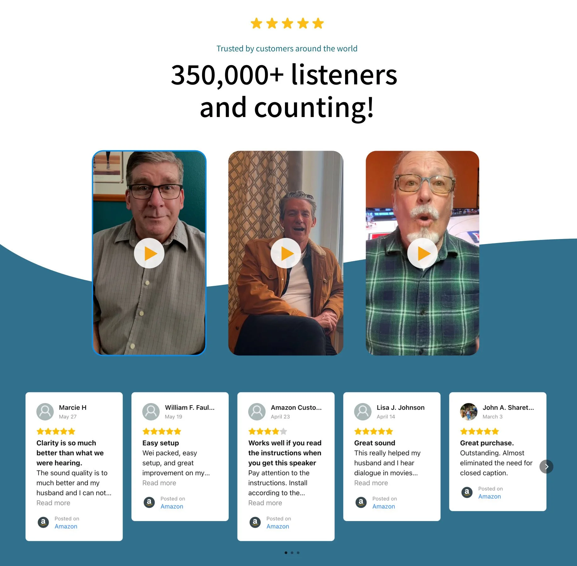
Social Proof
Reducing Purchase Anxiety
To strengthen credibility, especially addressing an older population reliant on reviews, I integrated Amazon reviews directly into the site experience and paired them with customer testimonials. This combination helped reduce uncertainty and correlated with a noticeable reduction in product returns. We also introduced other items as well, such as the total amount of purchasers “350,000 and counting” aside from keeping transparency of reviews on our Amazon for users to see if it was a best fit for them.
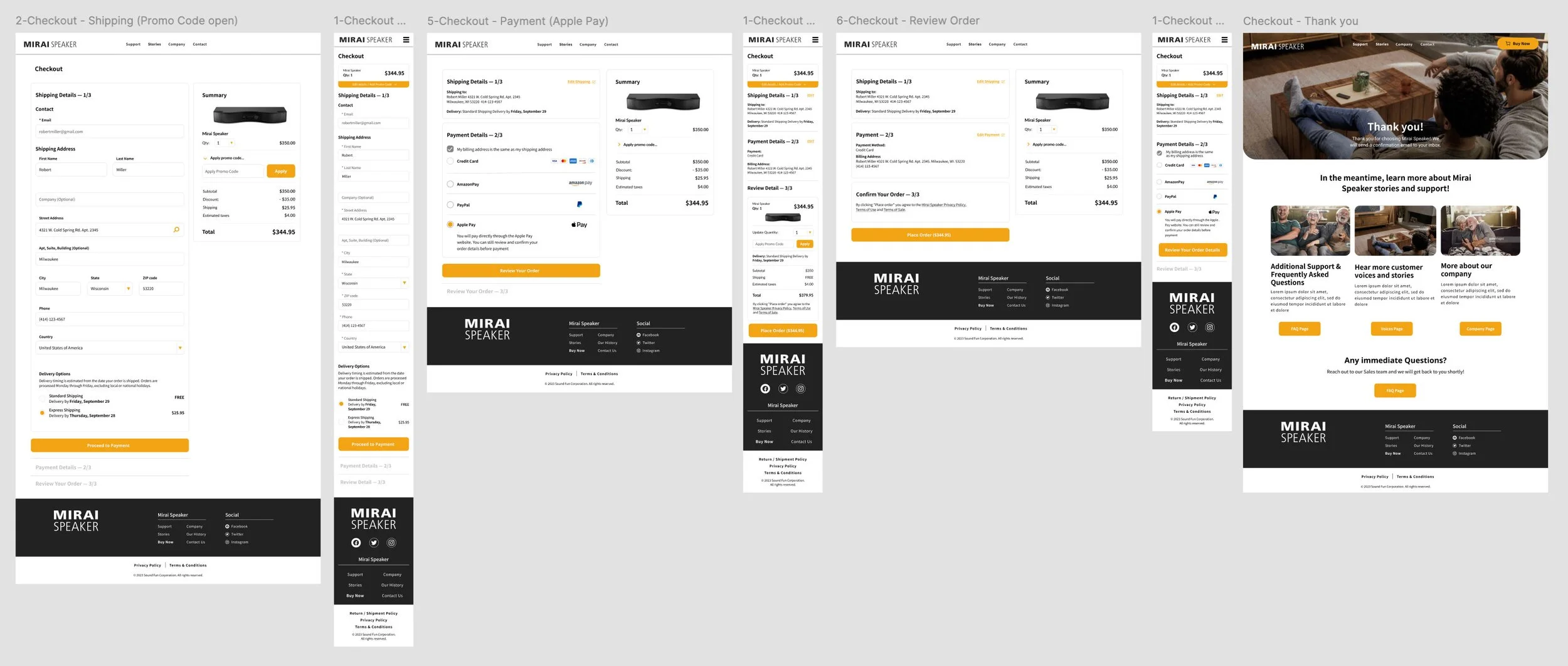
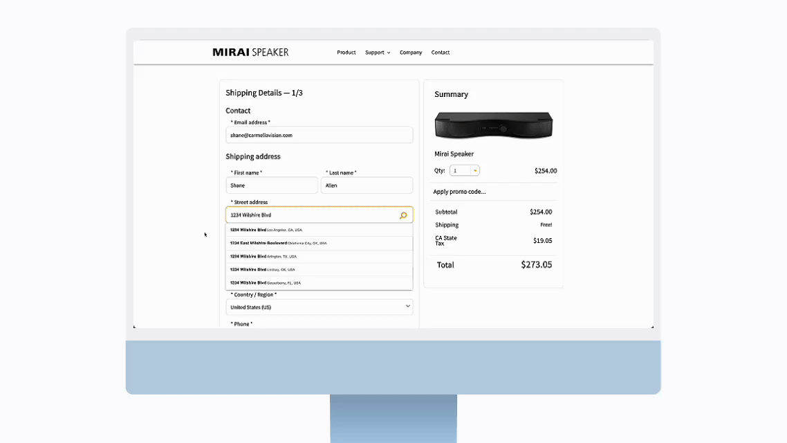
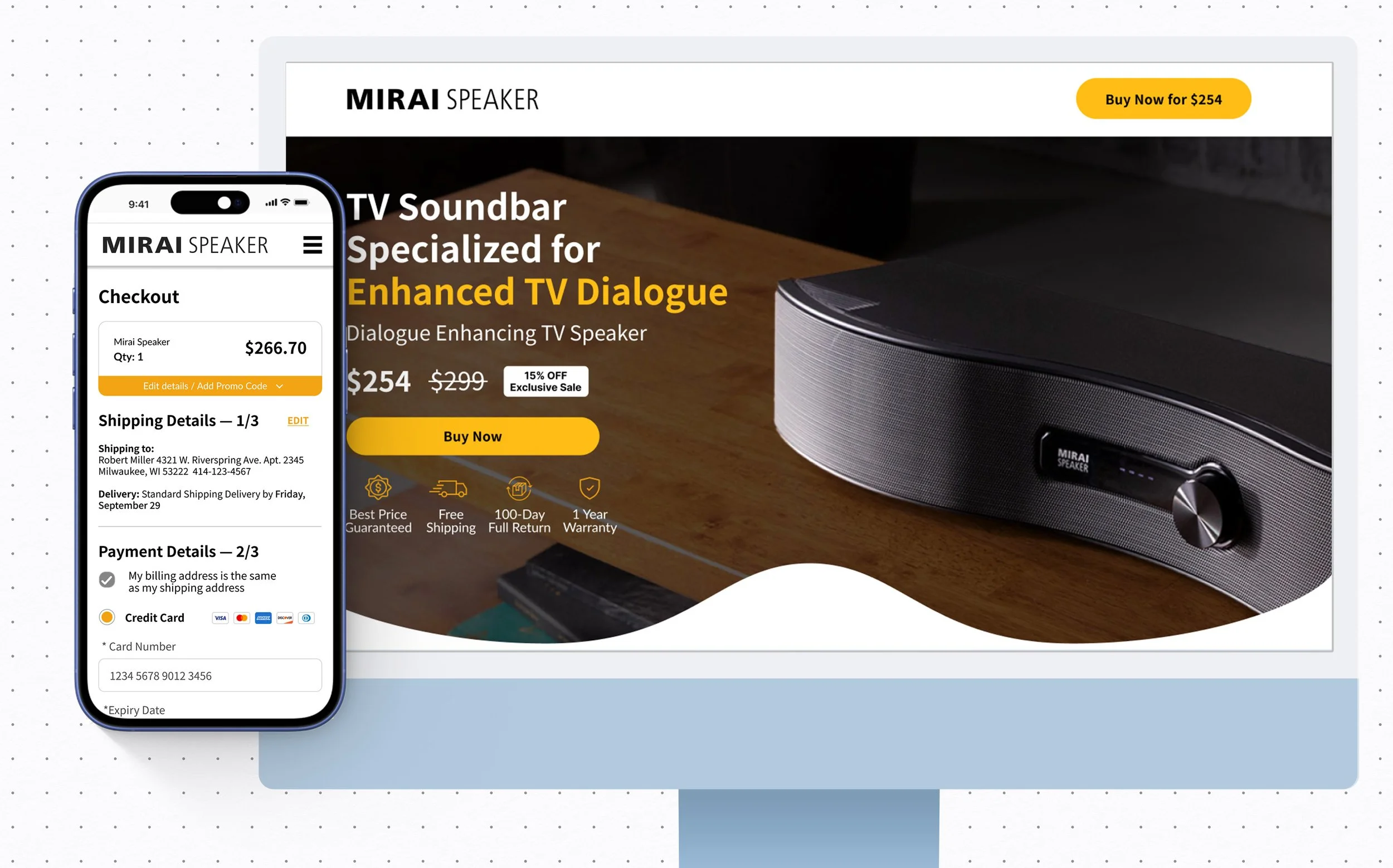
A partial sample of the checkout flow leading to thank you page, for conversion tracking purposes.
Reducing Checkout Friction
To support conversion, the checkout experience was designed / redesigned to:
Use a simplified three-step flow
Support one-click checkout
Enable autofill for address and payment details
Offer flexible payment options including Amazon Pay and PayPal
Integrated into the Digital Marketing flow for checkout conversions via Google Analytics, with continuous modifications, testing and upgrades
These changes significantly reduced friction at the final decision point and contributed to improved conversion rates.
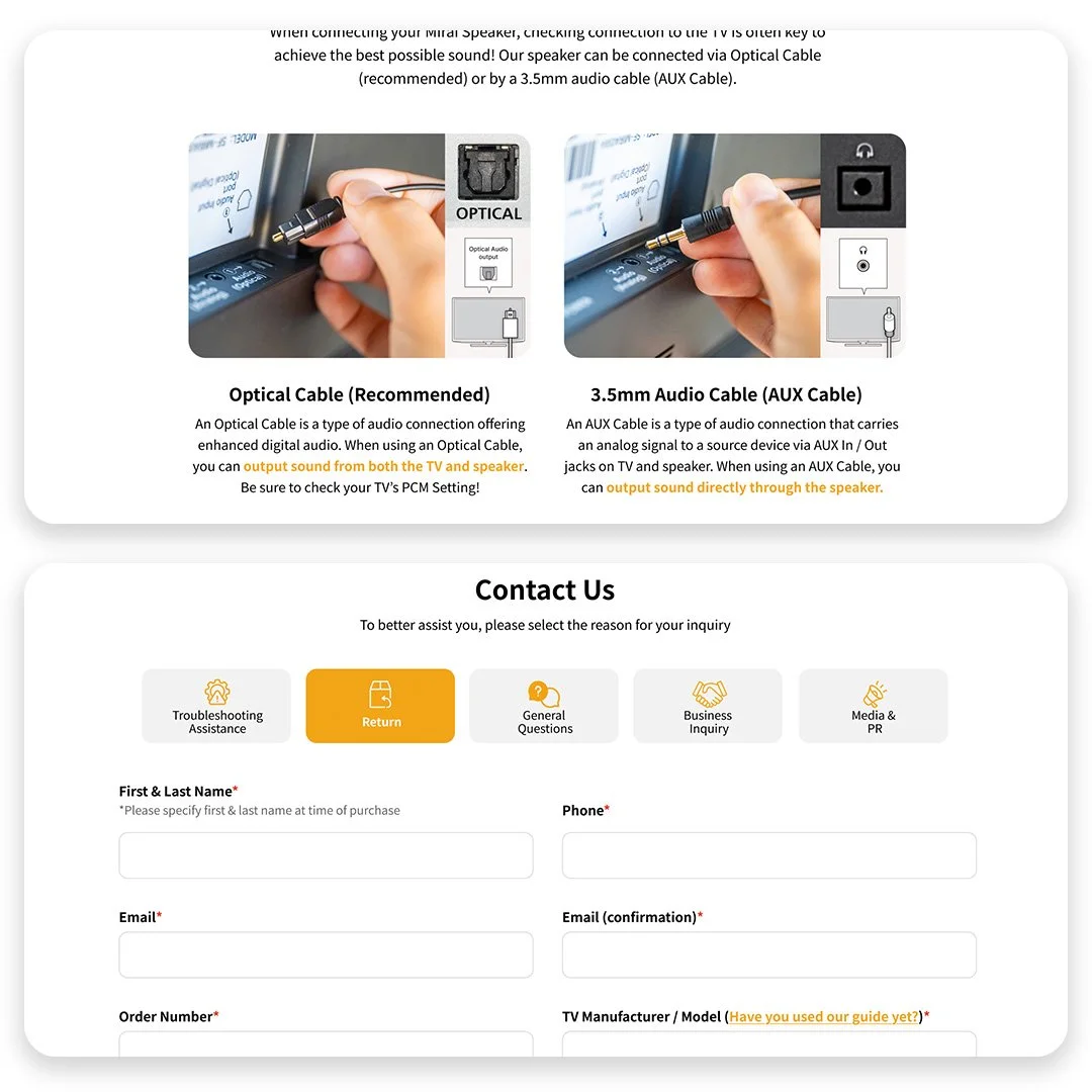
Connection and support pages.
Support as a Conversion Tool
Turning Support into Sales Enablement
A robust, searchable FAQ was introduced to address common concerns upfront. Connection guides got their own place on updated Support page. These new iterations not only reduced post-purchase support requests, but also helped users feel confident enough to complete their purchase — contributing to fewer returns.
Outcomes & Impact
Increased conversion rates, particularly during rapid A/B testing cycles
Increased time on key product and landing pages
Reduced product returns following improved clarity, social proof, and FAQs
Faster iteration of landing pages tied to live campaigns