Free Stock Photo Sites That Don't Make Your Brand Look Like Everyone Else's
And why your image choices are doing more storytelling than your copy.
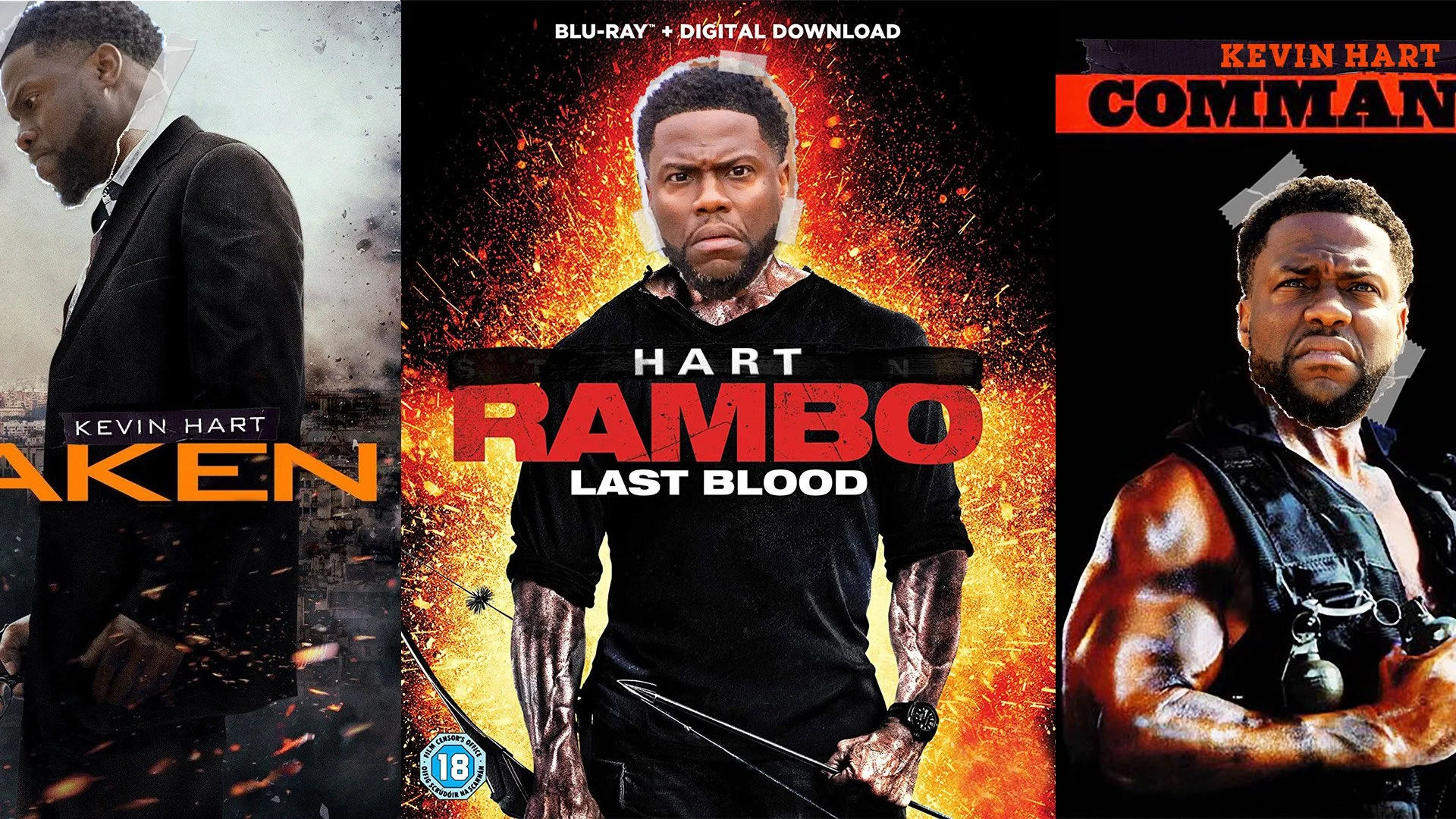
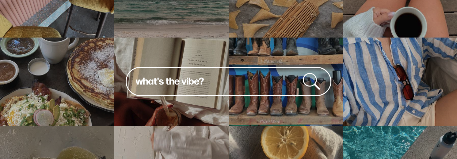
Let's be real — most marketers and content creators are working from the same visual playbook. Same overlit flat lays. Same laptop-on-desk entrepreneur shots. Same AI-generated human who almost has the right number of fingers.
The imagery you choose isn't just decoration. It's a signal. It tells people whether your brand has taste, a point of view, and any sense of cultural awareness — before a single word of copy lands.
The good news: you don't need a budget to fix this. You just need to know where to look. Here are four free image sites worth bookmarking, what makes each one different, and how to use them together strategically.
Why Stock Photos Keep Failing Marketers
The problem isn't that stock photography is bad. The problem is that everyone is pulling from the same handful of sources — and audiences have trained their eyes to recognize the aesthetic instantly. That split-second recognition creates distance. It signals 'this brand didn't try very hard.'
AI-generated imagery is accelerating this. There's now an entire visual language emerging around AI content — the overglossed contrast, the uncanny perfection and audiences are developing an instinct for it the same way they learned to spot a stock photo handshake.
The solution isn't necessarily more expensive. It's more intentional. That starts with your source material.
4 Free Image Sites Worth Bookmarking
Each of these solves a different problem. Use them together, not interchangeably.

1. Nappy
Website: nappy.co
Best for: Authentic representation of Black and Brown people in professional and everyday contexts.
Nappy was built to fill a gap that most stock libraries were actively ignoring. The founder created it because the imagery didn't exist at the scale or quality it should — and people were being left out of the visual language of modern marketing entirely.
What separates Nappy isn't just the subject matter. It's the feeling. These images show real people existing naturally — not posed diversity inserts, not performative inclusion. If your marketing is supposed to reflect your actual audience, your image library should do the same.
Use it when: your audience includes Black and Brown communities, you're building campaigns around authenticity, or when your current image bank has representation gaps that undermine your message.
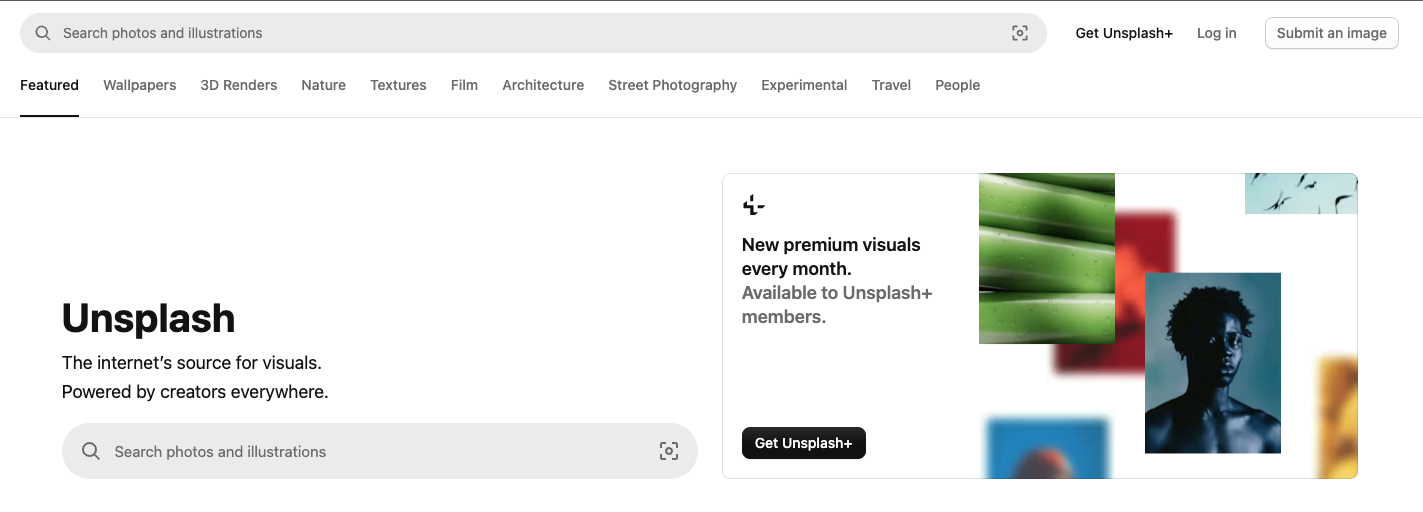
2. Unsplash
Website: unsplash.com
Best for: High-quality, editorial-feeling photography across virtually every category.
Unsplash was born from a genuine creative frustration: finding great, usable photography was harder than it should be. That founding energy still shows in the platform. With a contributor community of over 400,000 photographers, the breadth is real — and the quality ceiling is high.
The images here tend to feel warm and human rather than clinical. They photograph like something out of a well-edited magazine rather than a catalog. The search and collection tools are clean, which matters when you're working quickly.
Use it when: you need editorial-quality imagery for blog headers, social content, or branded storytelling — especially for lifestyle, nature, architecture, and people in natural environments.
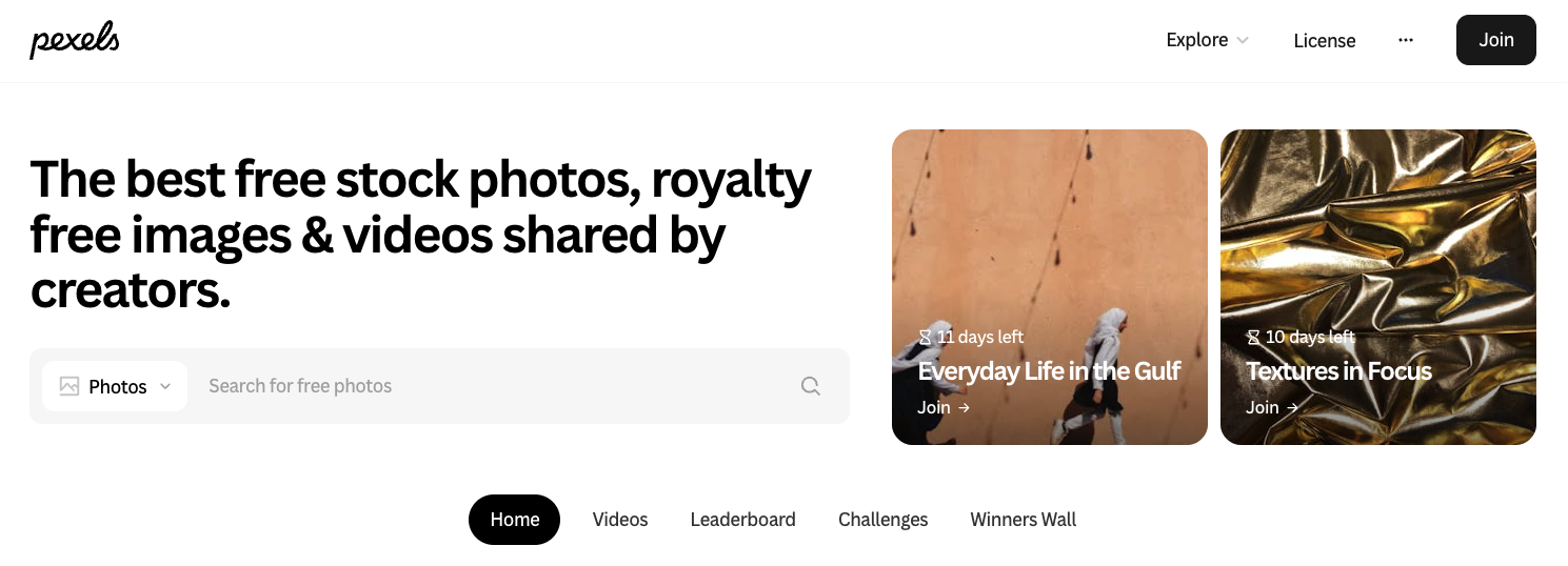
3. Pexels
Website: pexels.com
Best for: Free stock video as well as photography — an underrated combination.
Pexels is the one on this list that gives you video, which changes what's possible. Need a five-second loop for a pitch deck? A moody B-roll clip for a LinkedIn post? A scenic establishing shot for a brand reel? Pexels covers it without requiring a subscription or a licensing conversation.
The photo library also has a slightly different visual flavor from Unsplash — a bit more urban, more varied in color temperature — which makes the two complementary rather than redundant. If you can't find the tone you want in one, try the other.
Use it when: you need motion content for social video, presentation backgrounds, or animated assets — or when you want a visual tone that reads slightly more contemporary and street-level.
4. Dupe Photos
Website: dupephotos.com
Best for: Film-feeling, trend-aware imagery that looks like it came from a creative with a real point of view.
Dupe is the smallest library on this list and the most intentional one. The images don't feel like they came from a database. They feel like they came from someone who actually uses Instagram, knows what's resonating visually right now, and shot accordingly.
This is the site for when you're tired of imagery that feels algorithmically safe. If your brand has a defined aesthetic — editorial, analog, documentary — Dupe is worth digging into. It's still growing, which also means less saturation of the same images across competitor content.
Use it when: your brand has a strong visual identity and needs imagery that matches it, or when you're building campaigns that need to feel culturally current rather than generically professional.
How to Use These Sites Together
The mistake most content creators make is treating image sourcing like a single decision — pick a site, download a photo, done. The better approach is to think about visual consistency across a campaign and use each source for what it does best.
A practical starting point: define two or three visual moods your brand operates in. Maybe you have an aspirational mode, a behind-the-scenes mode, and a community mode. Each of those moods might draw from a different source. Unsplash for the editorial aspirational moments. Nappy when your community mode needs to reflect your audience. Dupe when you want the campaign to feel like it's speaking to a specific cultural moment.
Don't default to one site and drain it. Variety of source keeps your visual library from developing a recognizable stock-photo signature — which is exactly the problem you're trying to solve.

A Note on AI-Generated Imagery
AI image tools have real uses in a content workflow — rapid concepting, custom illustrations, placeholder visuals for early-stage creative development. The issue is when AI generation becomes the default rather than a deliberate choice.
The visual tells of AI imagery are becoming widely recognized: the overprocessed contrast, the unnatural skin texture, the occasional anatomical oddity. More broadly, AI images tend to feel like visual compromises — close to what you wanted but not quite landing. That 'not quite' registers with audiences even when they can't articulate it.
Photograph-based imagery from real photographers still carries authenticity signals that AI hasn't fully replicated. When you're building a brand that's meant to feel human, it's worth being deliberate about which tool you're reaching for and why.
The Bigger Picture
Visual strategy isn't a separate track from your content and messaging work. The images you choose are doing active storytelling — they're setting expectations, signaling values, and giving people a feeling before they've engaged with your words.
Marketers and content creators who treat imagery as an afterthought tend to produce content that feels assembled rather than crafted. The good news is that closing that gap doesn't require a larger budget. It requires more intentional choices — which starts with knowing your options.
These four sites are a real starting point. They're free, they're useful, and each one gives you something the others don't. Use them, build a library, and resist the pull of whatever's fastest.
Not sure where your visuals are falling short?
If you're trying to build a clearer visual direction for your brand or campaigns or you're stuck between 'I have all the tools' and 'I don't know what I'm actually making' that's worth a conversation. I help marketers and creative teams figure out what they're actually trying to build, and how to make it look like they meant it.
Reach out directly by contact or connect on LinkedIn to start the conversation.
CarmelloVision is a Tokyo-based design and strategy studio led by Shane Allen, a UX/UI designer and cross-cultural brand strategist with over 10 years of experience working inside Japanese and global teams. Having worked with clients across Japan, the United States, APAC, and the Middle East, CarmelloVision helps companies connect with new audiences through thoughtful UX, localization, and digital storytelling. If you're expanding into new markets or need digital positioning that actually crosses cultures, let's talk.
Check out these project case studies!