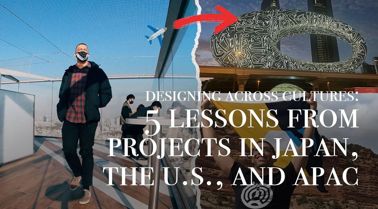
Designing Across Cultures: 5 Lessons from Projects in Japan, the U.S., and APAC
There's a moment in every cross-cultural project where you realize the design problem isn't really a design problem. It's a translation problem. Not language… but something deeper. How a culture feels trust. How it decides. How cultural understanding takes you the extra mile (and most importantly, kilometer).
I've been lucky enough to sit inside that moment several times now — working from Tokyo on projects that needed to land in the U.S., the Middle East, and beyond. Here are five lessons drawn from four very different projects that shaped how I think about designing for audiences who don't share your context.
A growing digital ecosystem, from video to UGC content, landing pages and more.
Lesson 1: Emotion Unlocks the Door That Specs Can't Open
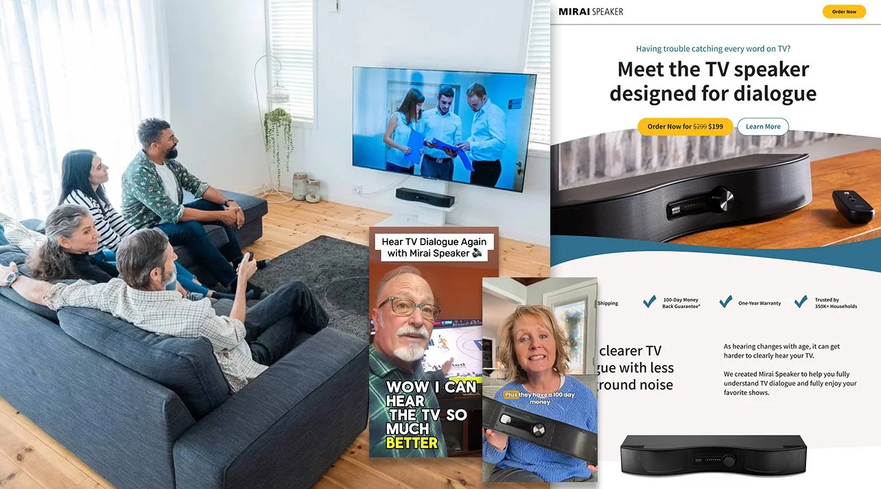
Project: Mirai Speaker (Soundfun) — Japan → U.S. Market
When I came on as the American strategic partner for Mirai Speaker's U.S. e-commerce expansion, the product was genuinely remarkable. Curved panel technology that clarifies TV audio for hard-of-hearing users. 450,000+ units sold. A real, meaningful innovation.
The challenge wasn't the product. It was the presentation.
Japanese product communication has a natural tendency to lead with precision — the engineering, the specifications, the technical differentiation. That approach works well in Japan, where trust is built through demonstrated expertise and detail. American consumers, especially older audiences making a considered purchase for something as personal as hearing clarity, need something different. They need to feel the difference before they commit. They also need a strong story, while needing to feel seen / heard.
So we shifted the entire UX strategy. Instead of leading with specs, we led with the experience and storytelling. We built an interactive sound comparison feature — so visitors could hear the difference with their own ears. We brought Amazon reviews directly onto the site. We introduced 450,000 customers as social proof, not as a footnote. We designed landing pages that had a conversation with the visitor rather than presenting a brochure at them. Social content lead back to the website, continuing the hook points. Also, we restructured the landing pages to also be a conversation with the user, rather than just telling them what the product was.
Conversions increased.
Returns dropped.
Trust grew, as well as ratings on Amazon!
The product didn't change…. how we translated it to the masses did.
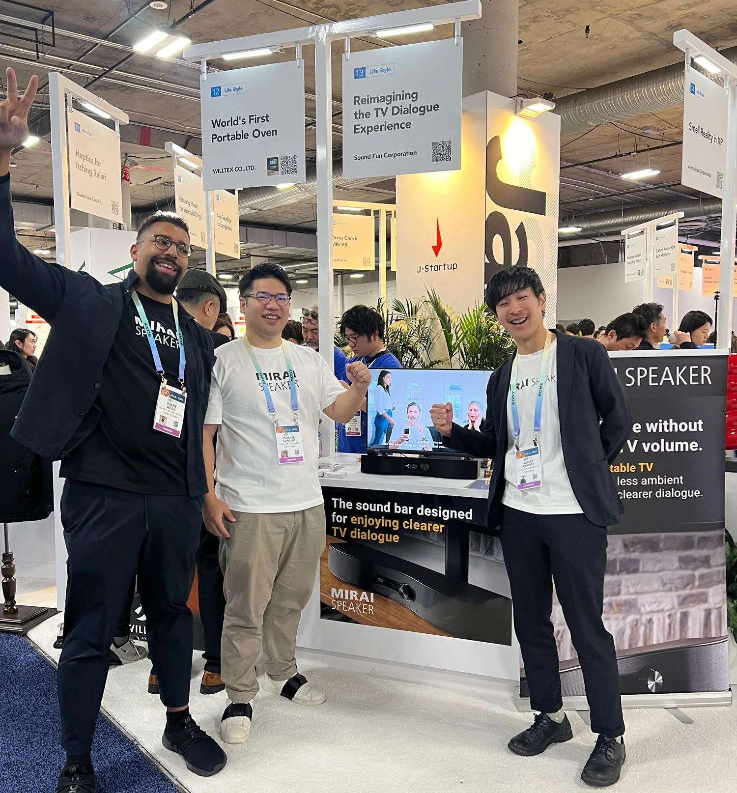
Attending CES Las Vegas with the Mirai Speaker Team.
What made this project especially meaningful was that it wasn't just remote work. I was deeply embedded in the world of this product — interviewing customers directly, connecting with tech enthusiasts, and representing Mirai Speaker as a Japan startup member with JETRO at CES Las Vegas. Standing on that floor, watching people encounter the product for the first time, react in real time — that kind of direct market immersion is irreplaceable. It's the difference between designing for a user persona and designing for a person you've actually met.
The lesson: When crossing cultures, ask not just "what does our product do?" but "what does trust feel like in this market?" The answer will shape everything from headline to checkout flow. And whenever possible, get in the room with the actual humans on the other side.

Setting the mood through landing page to content messaging.
Lesson 2: Credibility Has to Travel Before You Do
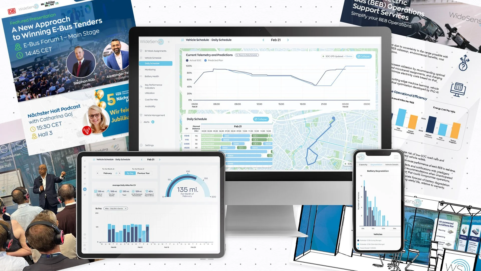
Project: fleetcast — Global Transport B2B
fleetcast entered the public transport sector with a genuinely smart offering — analytics and transition planning for bus fleet operators navigating the bid-to-operations performance gap. They weren’t particularly a new entrant in the industry with an extensive proven track record, however were reestablishing themselves in the market with a new focus. Their product was global. But their new direction was not yet.
My job was to design a web presence that could establish trust before any human sales conversation took place. In enterprise B2B, especially across different markets, the website isn't just marketing — it's the first handshake. The way the site looks, how the copy is structured, whether information is clear in seconds rather than minutes — all of it signals whether this company is worth a conversation.
I positioned fleetcast's three offerings directly on the landing page — Spotlight, 360, and Transition Planning — giving each a dedicated space to breathe, as well as following the same clear logic: what it is, why operators use it, what you get, how it connects to the others. No jargon. No generic analytics language. Direct communication to fleet decision-makers who understand buses, routes, and depot operations in an editorial-like fashion.
The visual language was deliberate: real buses, real depots, motion and data that felt alive rather than decorative. The CTA language — "Talk to the team" — was conversational without being casual. The goal was to feel like a serious partner, not a vendor trying to close a deal.
The lesson: In B2B, trust must be encoded into every design decision — typography, copy structure, the exact wording of a button. When your audience spans multiple markets, that trust-building has to work without cultural context you can't assume. Clarity is the only universal language.
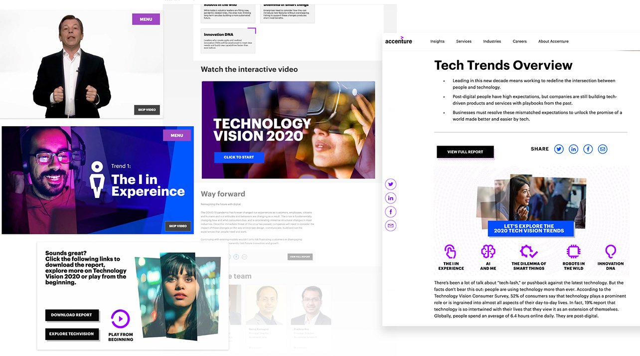
A collection of screens from TechVision 2020.
Lesson 3: Interactivity Is a Global Language — But Messaging Is Local
Project: Accenture Interactive — TechVision 2020, Bengaluru
One of the most creatively exciting projects I've worked on was an interactive video experience for Accenture's TechVision 2020. The brief started with a pre-recorded presentation by Marc Carrel-Billiard, Accenture's Global Technology R&D Lead, exploring the tech clash shaping the post-digital world.
The Accenture India team — based in Bengaluru, one of the most innovative hubs in the Accenture network — had an appetite for pushing the format further. When they came looking for something interactive, I took the lead. Working with a previous agency, I drove the concept and built it out end-to-end: leading external project managers across the collaboration, leading our internal Developers and handling the UX and UI design myself.
The idea that emerged was a choose-your-own-adventure journey embedded on the Accenture.com landing page. Visitors could engage with Marc's ideas directly, answer yes/no questions, and receive different perspectives and insights based on their responses. It was story-mapped around his presentation — a living, branching conversation rather than a passive video.
What struck me throughout this project was how the experience needed to work across very different global audiences — existing clients, prospects, media, and the general public, from multiple regions. The interactive format itself was the bridge. But the messaging at each fork in the journey had to feel relevant whether you were a C-suite executive in Japan, a product team in Singapore, or a technologist in London. Getting that right required both creative instinct and close coordination across teams who didn't share the same working culture or priorities.
The marketing teams ultimately shared it across their social channels globally. It became a demonstration of Accenture's own strengths in digital interaction — not just talking about digital innovation, but embodying it. That's the most powerful kind of cross-cultural communication: showing, not telling.
The lesson: Format can travel. But every decision point in an interactive experience is a messaging decision. When you're designing for global audiences, treat each choice architecture moment as an opportunity to speak across contexts — not just to one kind of viewer.
Dubai is filled with many amazing people and great tastes, which gave inspiration into LP updates and whitepapers.
Lesson 4: Authenticity Is a Competitive Advantage — Especially in Noisy Markets
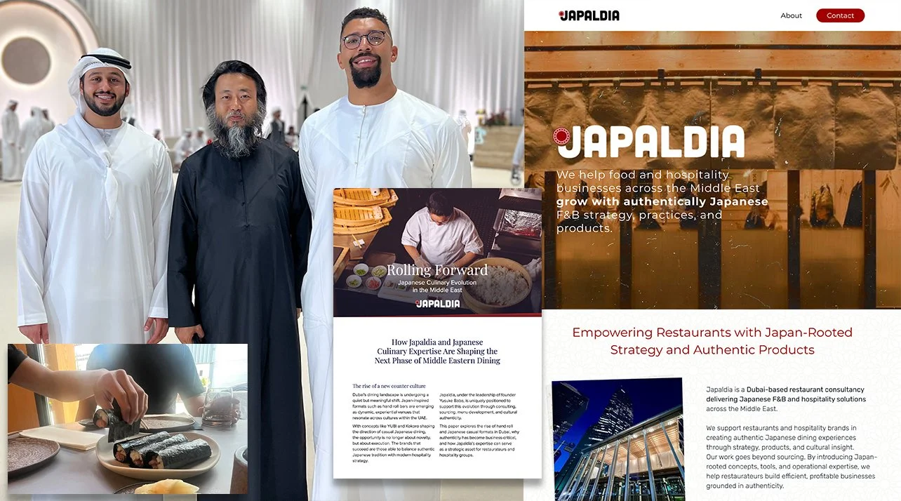
Project: Japaldia — Japan → Dubai
A year ago I helped a friend take his Japanese restaurant consulting business, Japaldia, from zero digital presence in Dubai to a #1 Google ranking and a major contract — in 90 days, with no ad spend.
The site I built wasn't elaborate. A Wix build, under a week, English-first, mobile-optimized. But every decision was grounded in one strategic insight: Dubai's Japanese food scene was booming, and most of it was surface-level. Instagram-beautiful. Trend-driven. And potential clients looking for a serious consultancy could feel the difference — they just needed a clear, credible signal to find it.
Japanese sensibilities around restraint, craft, and precision became the entire positioning. The site didn't try to compete with the noise. It stepped to the side of it. Within six weeks it ranked first. Within three months it generated a full consulting contract covering concept development, supplier vetting, operational setup, and staff training for a hand roll bar concept — and funded two research trips to Dubai.
Being on the ground there reinforced what the design had already signaled. We visited over 12 hand roll bars across Jumeirah Beach, Business Bay, and DIFC. We talked to chefs who were still adjusting nori texture during service when no customers were watching. That level of commitment to fundamentals — even when no one is looking — was exactly what separated Japaldia's value from everyone else in the market.
The lesson: When you're entering a new market, don't try to speak that market's language superficially. Bring the depth of your own culture's values and let that specificity be the differentiator. Authenticity reads across borders. Imitation doesn't.
Exploring Greece for the culture.
Lesson 5: The Bridge Goes Both Ways
Across all of these projects — Japan to the U.S., Japan to Dubai, Bengaluru to the global stage, fleet operators around the world — the pattern that emerges is this: the best cross-cultural design doesn't flatten differences. It uses them.
What I learned in Dubai about the Dubai market informed how Japaldia communicated back in Japan. What I learned from American e-commerce behavior on the Mirai Speaker project changed how I think about trust-building UX in any market. What the Accenture India team's appetite for experimentation taught me about creative ambition influenced how I approach format-breaking work everywhere.
The bridge isn't just a path from one side to another. It's a place where you learn things you couldn't learn standing on either shore.
That's what CarmelloVision is — a cross-cultural design and storytelling partner for brands that want to connect across contexts, not just communicate within them. Whether you're a Japanese brand entering the U.S. market, a Tokyo-based startup looking toward the Middle East, or a global enterprise needing digital work that translates across regions, the work starts in the same place: genuinely understanding what's on both sides before you start building.
CarmelloVision is a Tokyo-based design and strategy studio led by Shane Allen, a UX/UI designer and cross-cultural brand strategist with over 10 years of experience working inside Japanese and global teams. Having worked with clients across Japan, the United States, APAC, and the Middle East, CarmelloVision helps companies connect with new audiences through thoughtful UX, localization, and digital storytelling. If you're expanding into new markets or need digital positioning that actually crosses cultures, let's talk.
Check out these project case studies!