Why Good Design Fails When Products Cross Borders
By Shane Allen | CarmelloVision
A product can be beautifully designed and still fail in another market. Not because the design was wrong — but because the interpretation was.
This is one of the most expensive blind spots in global expansion. Companies invest in polished interfaces, professional translation, and market research. They launch. And then they watch conversion rates flatline in markets where the product should work perfectly.
The design isn't broken. The cultural bridge is missing.
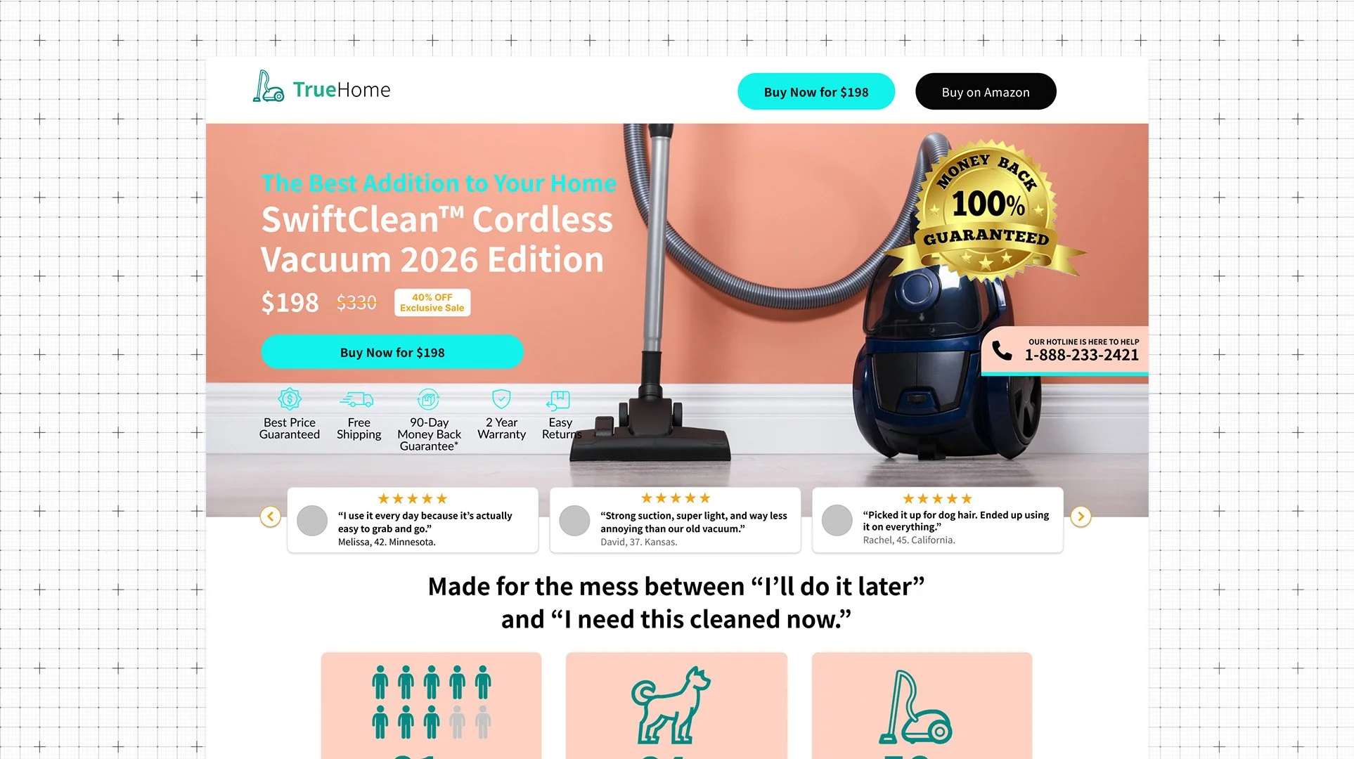
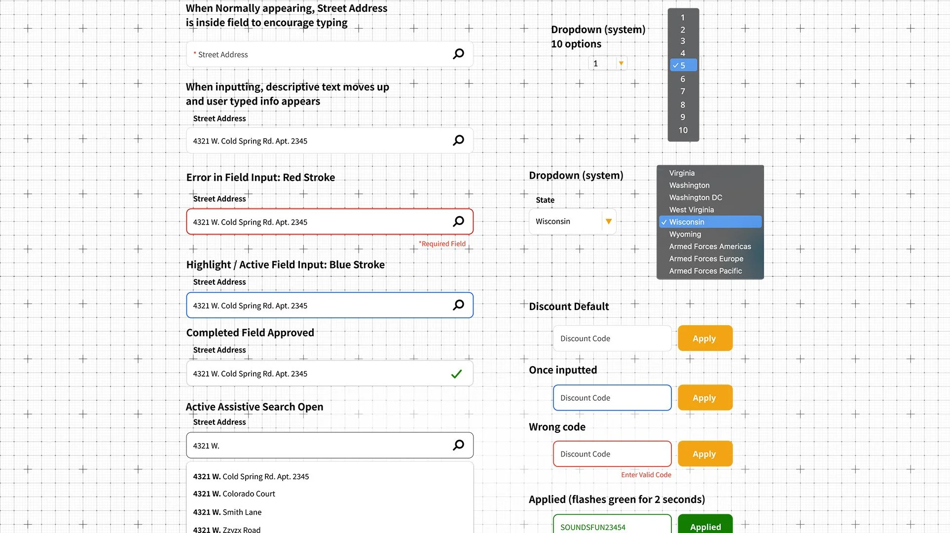
A sample page filled with a lot of information
The Page That Was Trying Too Hard
A client's product was performing well in Japan — the market fit was real, the audience understood it. The challenge was the US.
Their instinct, understandably, was to add more. More explanation. More features listed. More proof points stacked onto the landing page. In Japanese UX, thoroughness signals credibility. A fully detailed page tells the user: we thought about every question you might have before you had it.
I kept pushing back. American readers scan. When a page asks too much of them upfront… when it front-loads every benefit and feature before the reader has decided they care… they leave. Not because the product isn't good. Because the page made them work too hard to find out.
I still remember a design agency recruiter back in my hometown of Milwaukee — reviewing my early work, she looked at me and said: "You have to lead with your cleavage." It landed like a joke, but it's one of the truest things I've heard about how attention actually works, especially in eCommerce. Hook first. Earn the explanation later.
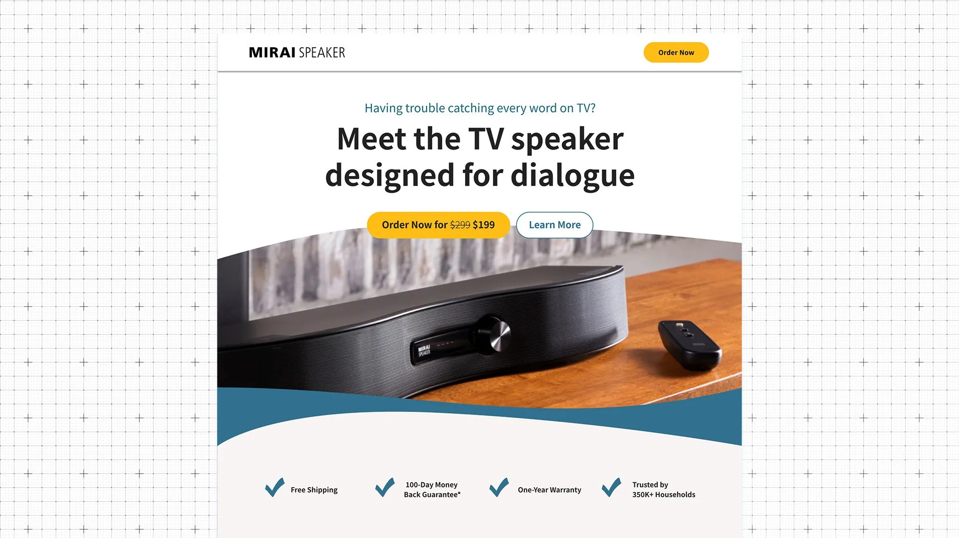
Eventually we tested a different approach entirely. Instead of stacking product benefits in blocks, we built a conversational flow the reader could move through naturally… arriving at the value as they scrolled. Less declaration, more dialogue. A better format for telling the story.
It performed much better.
That's the tension at the center of cross-cultural design. The team wasn't doing anything wrong. They were designing with real intention and real cultural expertise. They just brought the wrong audience's instincts to the brief.
The Translation Trap
Most international launches treat localization as a final step. The product is built, tested, and approved — then handed off for translation. Language gets swapped. Currency formats get updated. A regional flag gets added to the footer.
This is strictly translation. It is not localization nor designing with culture in mind.
Let’s say you designed the manual 1:1, from Japan to Korea... but then after you get 2000 sheets printed and shipped your buyer realizes that the AC plug illustration is not even Korea's Type C/F version in the instructions. Maybe the customer shrugs it off, but subconsciously its a trust factor. Wait until they call Customer Service...
The gap between those things is where revenue disappears.
Politeness reads as weakness. Japanese communication defaults to indirect, deferential language — out of respect, not uncertainty. When that tone carries into English-language copy, it can read as a brand that isn't confident in its own product. Western users expect brands to lead. The hedging that signals respect in one language signals doubt in another.
Indirect messaging confuses direct cultures. In many East Asian communication styles, the point arrives at the end of the message — after context has been established. Western UX copy often works in reverse: lead with the claim, support it afterward. When you map one structure onto the other market's expectations, users either don't trust the message or don't know what action they're supposed to take.
Explanation is not always reassurance. In some markets, detailed product explanations build confidence. In others particularly where a well-designed product is expected to speak for itself — too much explanation raises questions: Why does this need so much justification? What aren't they telling me?
The inverse is equally true. A Japanese team designing for US audiences may over-explain out of respect for providing information to fully understand / gain trust — not realizing that American users interpret density as complexity, and complexity as friction.
As an American, I do love that subtle feeling hidden in the whitespace.

Trust Signals Are Not Universal
Every market has a shorthand for this is legitimate. The problem is that shorthand is invisible until you've spent real time inside a culture.
In Japan, trust is built through:
Formality and hierarchy — who is behind the product, their credentials, their affiliations
Structured, thorough information presented in a specific visual hierarchy
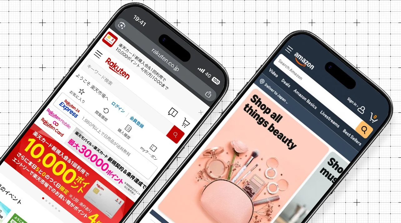
Established visual conventions (which is part of why Japanese websites look "busy" to Western eyes — they're dense with trust signals that Japanese users read instantly)
Patience in the buying journey — a shorter funnel isn't always better
This isn't speculation — commerce data consistently shows that minimal web designs can register as untrustworthy to Japanese shoppers, while text-dense pages that feel overwhelming to Western users are reading as thorough and credible. Although there are hints of a minimalist boom in Japan at the moment.
Another example is from a front-end engineer based in Japan, who put it plainly in a comment that stuck with me recently: Japanese users want detailed information on any device… and if a site gets something wrong, complaints follow. Companies know this. Text density isn't a stylistic choice. It can also be risk management.
In the US and most Western markets, trust is built through:
Speed and simplicity — if it looks complicated, it probably is
Social proof front-loaded, not buried
Directness — what it does, what it costs, what happens next
Confidence in copy — no hedging, no over-explaining
A design team optimizing for one of these will, by default, undermine the other. It's a behavioral design problem, requiring a different kind of expertise to solve.
The UX Friction Most Teams Never See
Beyond copy and messaging, there's a layer of interface design that creates friction your analytics will capture — but won't explain.
Payment flows. The sequence, the fields, the validation logic, the visual hierarchy of a checkout — these carry cultural assumptions baked in by whoever designed them. A payment flow built for a US credit-card-first market can feel disorienting in markets where QR payments, convenience store settlement, or bank transfers are the default behavior. The flow isn't wrong — it's just unfamiliar in ways that spike drop-off and never show up in your A/B tests.
Features like Afterpay and one-click checkout even can meaningfully lift conversion in the US… but only when the product and price point make sense for them. The friction you remove has to match the friction your specific buyer actually feels.
Onboarding. How much do you explain upfront? How much do you leave for discovery? The answer differs significantly by market. Some users expect to be guided through every step. Others interpret excessive onboarding as a sign the product isn't intuitive. The same flow reads as helpful in one market and condescending in another.
Microcopy. Button labels, error messages, empty states, confirmation dialogs — these are the smallest pieces of an interface and carry disproportionate cultural weight. The difference between "Submit" and "Confirm" isn't just tone; in some markets, one implies finality and one implies reversibility. Getting these wrong doesn't cause users to bounce — it causes them to hesitate, second-guess, and quietly not return.
Product explanations and feature naming. What you call something signals what it's for and who it's for. Names that feel intuitive in English can be opaque or carry unintended connotations in other languages — even after translation. This is particularly true for products in health, finance, and services that carry social meaning.
The teams who built these flows were excellent designers. None of them were designing for the wrong market on purpose. They were optimizing for what they knew.

The Cross-Border Design Layer
What companies actually need when they expand globally isn't a larger design team or a regional translation vendor.
They need a layer between product and market — someone who can sit at the intersection of:
Product thinking
Understanding how the thing actually works, what decisions were made and why, and where the constraints are.
Cultural fluency
Not just knowing facts about a market, but having internalized how people in that market feel when they encounter information, interfaces, and buying decisions.
Communication strategy
Knowing which message to lead with, how to sequence information, what to prove and what to leave unsaid.
Behavioral design
Understanding that the same desired action (a booking, a signup, a purchase) requires different friction, different signals, and different pacing depending on the cultural context. The psychology behind it all.
Most generalist agencies offer one or two of these. They hire a translator for the language piece, a local designer for the visual piece, and assume the strategy carries over from the original market.
It doesn't. And the conversion data eventually makes that clear.
What This Looks Like in Practice
The good news: this doesn't require rebuilding your product for every market. In most cases it's a targeted intervention —
Reframing the trust architecture of a homepage for a specific audience
Restructuring a payment or booking flow around local expectations
Rewriting microcopy to carry the right weight in context
Adding or removing explanation based on how much is expected versus how much creates doubt
The work isn't about making things look different. It's about making them mean the right thing.
Frequently Asked Questions
-
What reads as "busy" to a Western eye is a dense set of trust signals, information hierarchy markers, and navigational cues that Japanese users process quickly. But the reason this visual language exists goes deeper than aesthetics or culture.
Japan had mobile internet — email, cameras, 3G — nearly a decade before the West. When the iPhone forced Western web design to simplify for small screens, Japanese designers didn't need to follow. Their users weren't switching.
So while the rest of the world streamlined, Japan's web held its density. What looks cluttered from the outside is really a design tradition that was never interrupted.
Applying Western minimalism directly to a Japanese-market site often removes the very signals users have been reading for twenty years
-
Localization adapts surface elements: language, currency, date formats, imagery. Cultural design goes deeper — it examines how trust is built, how decisions are made, how information should be sequenced, and what the interface implies about the brand. Localization gets the words right. Cultural design gets the meaning right.
-
Ideally before launch, as part of the strategy phase. In practice, most companies address it after they notice underperformance in a specific market. Either way, the intervention is usually faster and less expensive than expected — because the product is already built. What changes is the interpretation layer around it.
-
No. The Japan/US contrast is one of the sharpest and most documented, which makes it useful for illustration. But the same dynamics exist across all cross-border expansions — Southeast Asia, the Middle East, Europe, Latin America. Every market has trust signals, communication norms, and behavioral patterns that are invisible until you've had time to internalize them.
The Real Problem Isn't Design
When companies underperform in a new market, the instinct is to frame it as a design problem. The interface needs to be cleaner. The translation needs to be better. The funnel needs to be shorter.
Sometimes those things are true.
But more often, the design is fine. The product is good. What's missing is the interpretive layer — the bridge between what the product does and what it means to a specific audience in a specific cultural context.
That bridge requires more than design skills. It requires someone who has actually lived on both sides of it.
I might be able to help you here, if you’re curious on improving your own digital ecosystem.
That bridge requires more than design skills. It requires someone who has actually lived on both sides of it.
If you're expanding into a new market or wondering why an existing one isn't converting the way it should — let's talk.
CarmelloVision is a Tokyo-based design and strategy studio led by Shane Allen, a UX/UI designer and cross-cultural brand strategist with over 10 years of experience working inside Japanese and global teams. Having worked with clients across Japan, the United States, APAC, and the Middle East, CarmelloVision helps companies connect with new audiences through thoughtful UX, localization, and digital storytelling. If you're expanding into new markets or need digital positioning that actually crosses cultures, let's talk.
Check out these project case studies!