Brand Identity & Website for a Japanese-Inspired Villa in Sri Lanka
A Tokyo-based owner wanted her Sri Lankan beach villa to carry a Japanese soul. The name said it all — Seigaiha, the traditional wave pattern. The challenge was making that reference feel genuinely rooted in both cultures rather than decorative.
THE SITUATION
A Tokyo-based businesswoman was opening a boutique villa in Hiriketiya — a surf town on Sri Lanka's southern coast. She had fallen in love with Japan and wanted that love to live in the space itself: in the design of the rooms, in the objects on the tables, in the patterns on the cups. The brand needed to reflect that same sensibility.
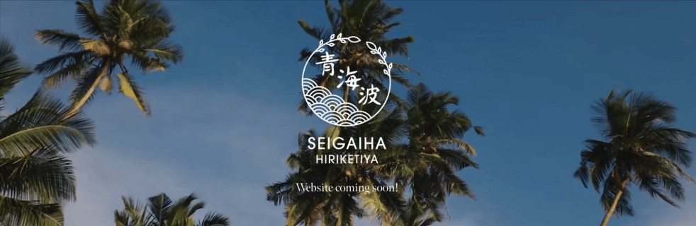
The name she chose, Seigaiha (青海波), is a traditional Japanese wave pattern with centuries of meaning behind it — tranquility, the ocean, the desire for continued peaceful living. It was perfect. But it needed to be reimagined for a villa hidden in Sri Lankan jungle.
SCOPE DELIVERED
Logo & Brand Identity (from scratch) Website Design & Build Photography Art Direction Video Integration Email Booking System
ROLE
Brand Designer & UX/UI Lead
CLIENT
Seigaiha Hiriketiya Villa. Sri Lanka.
TIMELINE
2022
Visit seigaihahiriketiya.com
THE CHALLENGE
Three things had to work together without any one of them feeling forced.
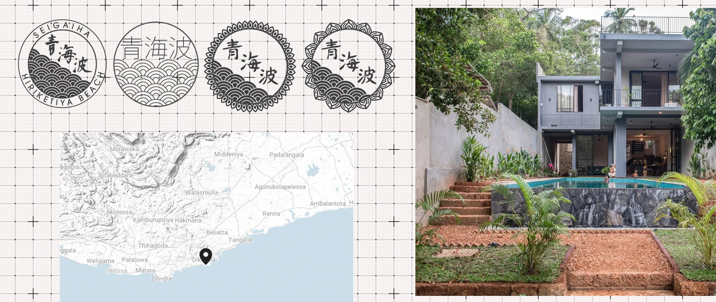
The logo needed to honor the Seigaiha pattern without simply reproducing it — it had to feel designed for this specific place, not borrowed from another culture.
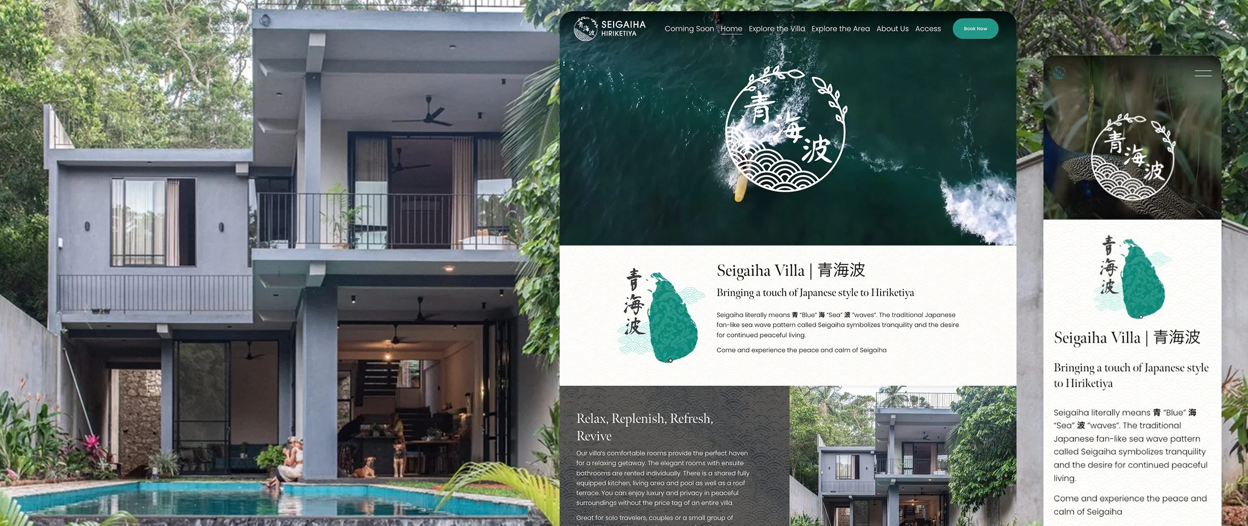
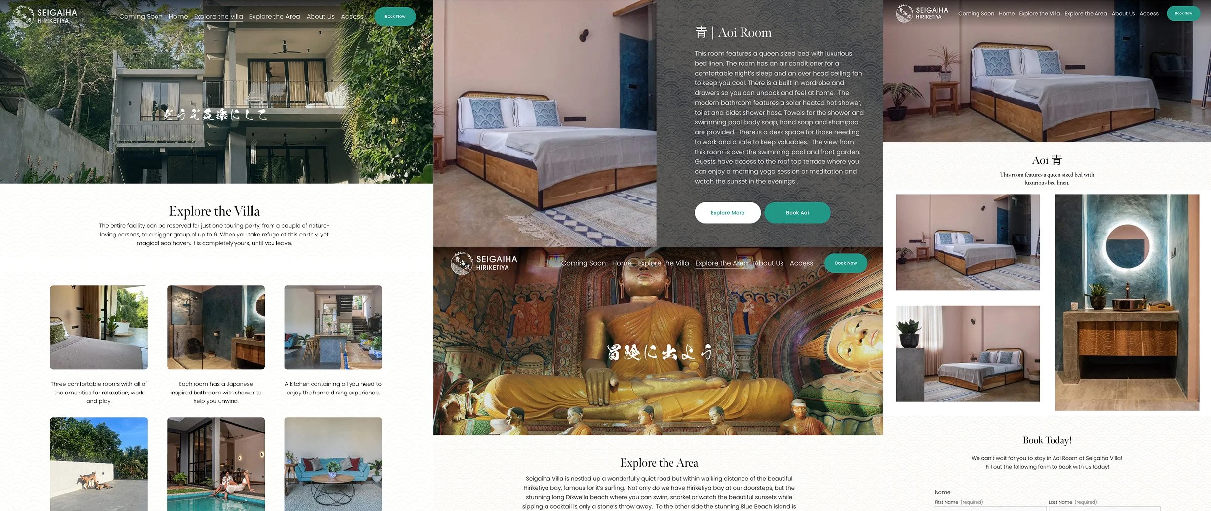
The website needed to do what most villa sites fail to do: make someone feel the atmosphere before they book. That meant using the owner's photography and video as the primary storytelling medium, not as decoration around the copy.
The booking system needed to be simple — the villa operates more like a high-end Airbnb than a hotel, with rooms rented individually and the owner managing enquiries directly. No complex platform. Just a clean form that sent enquiries straight to her.
THE SOLUTION
Brand Identity
The logo started with the Seigaiha pattern as its foundation — the overlapping wave scales that give the villa its name. Rather than treating it as a flat motif, I reframed it within the circular form of a Kamon (Japanese family crest), wrapping organic vine motifs around the outside to reflect Hiriketiya's jungle setting. The result is a mark that feels rooted in both cultures simultaneously — Japanese in structure, tropical in texture, specific to this one place hidden up a quiet cul-de-sac in a Sri Lankan coastal village. Additional consideration for how it’d fit on website along with goods found in the house was applied.
Website
The site was built on Squarespace with a deliberate emphasis on atmosphere over information. The owner supplied photography from a villa shoot I arranged — warm, natural images that show the greenery of the surrounding jungle against the clean modern architecture, with Japanese accents throughout: Seigaiha-patterned tables, ceramics, and details that connect directly back to the logo. A video of the island and the villa runs in the hero section on the home page, giving visitors a sense of movement and place before they read a single word.
Navigation was kept minimal — Home, Explore the Villa, Explore the Area, About, Access, Book Now. Each section answered one question a potential guest would have, in the order they'd naturally ask it.
Booking System
Rather than a third-party platform, I recommended and built a direct enquiry system — a clean form that routes booking requests straight to the owner via email. Simple, personal, and right for the scale of the operation.
WHAT THIS REINFORCED
The Seigaiha pattern means tranquility and the desire for continued peaceful living. Getting that meaning to show up in a logo, in a website, in a booking experience — for a place most guests will find on their phones before they've ever heard of Hiriketiya — is the kind of problem I find genuinely interesting.
Cross-cultural design isn't about mixing references. It's about understanding what something means in its original context and finding the honest translation for a new one.
CarmelloVision is a Tokyo-based digital partner for companies expanding between Japan and global markets. Founder Shane Allen combines cross-cultural UX strategy, design execution, and over a decade of experience working inside Japanese and global teams to help brands navigate unfamiliar markets and build meaningful connections across cultures.