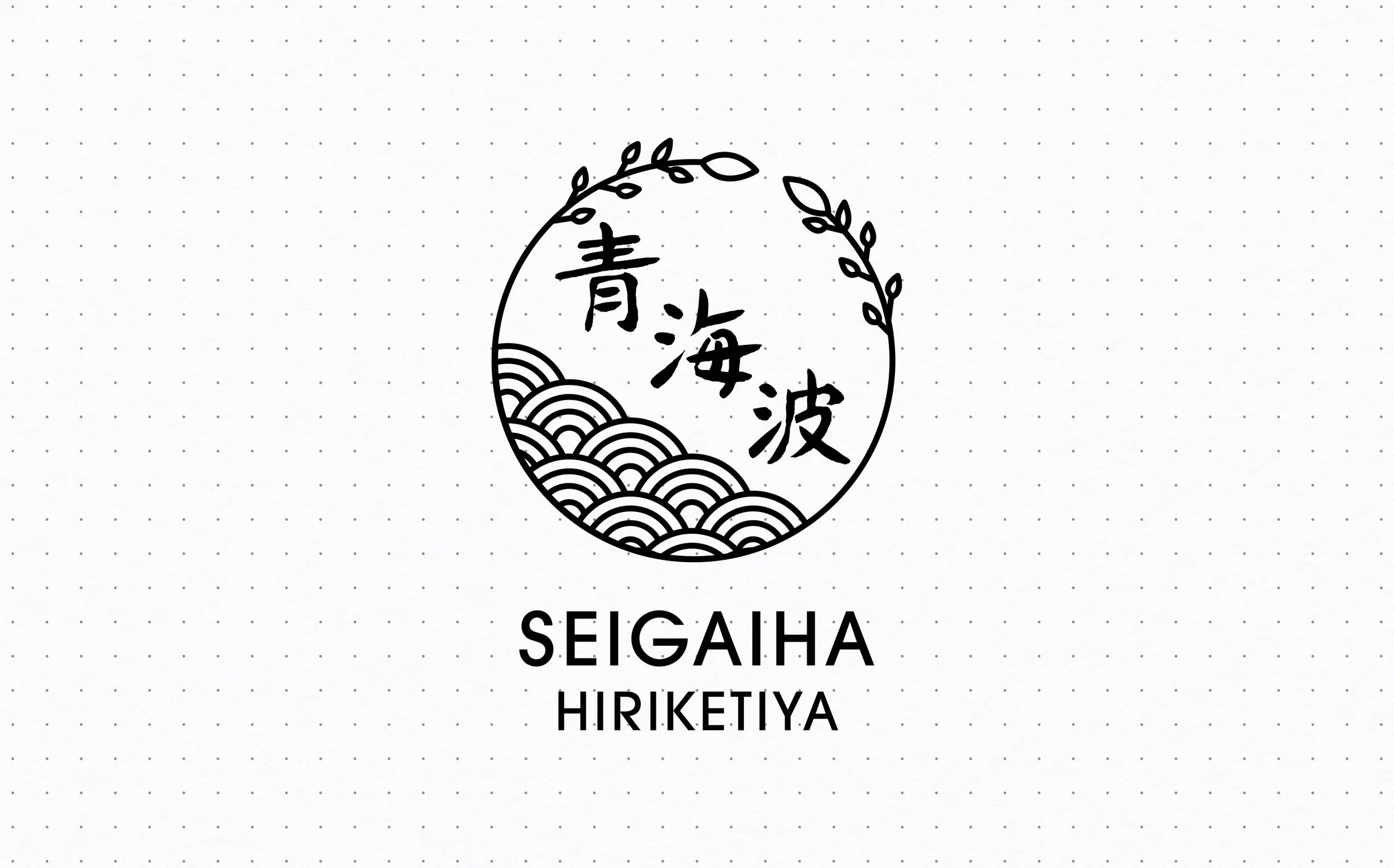
Seigaiha Hiriketiya Villa Logo
Blending Japanese tradition with Sri Lankan coastal energy, this brand identity reimagines the Seigaiha motif as a kamon (creast) for a boutique B&B.
The Challenge
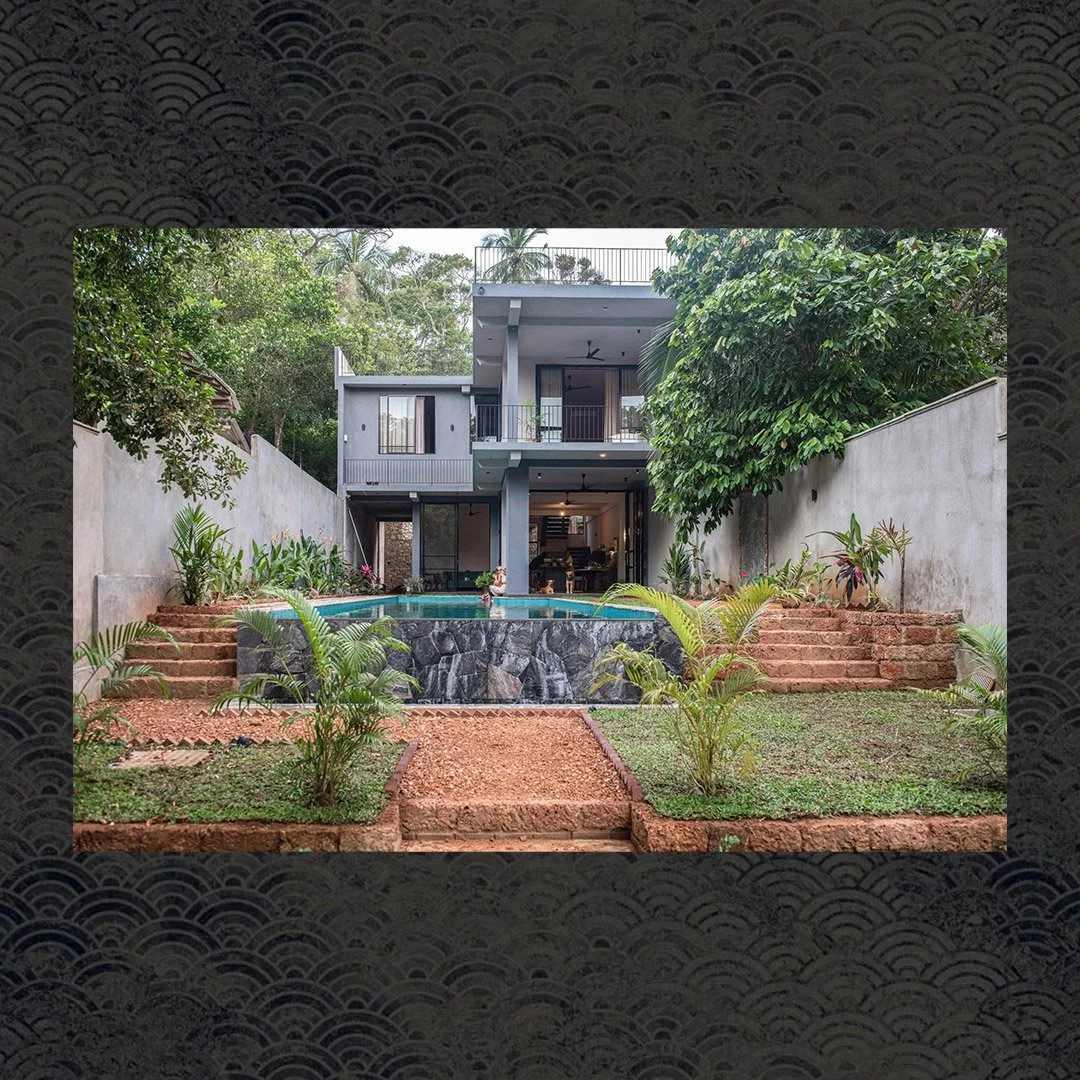
A Tokyo-based expat and businesswoman was launching a boutique bed & breakfast in the Sri Lankan beach town of Hiriketiya, with a vision to infuse the space with Japanese cultural elements. She had fallen in love with Japan and wanted her venue’s identity to reflect that — starting with a logo that captured the spirit of both Japan and the local community. The name of the venue, Seigaiha (青海波), a traditional Japanese wave pattern, was to be central to the identity — but needed to be reimagined in a way that felt rooted in Sri Lanka’s lush, coastal landscape.
The Solution
Through an iterative design process, I explored the intersection of Japanese tradition and tropical context. I used the Seigaiha pattern as the foundation, weaving it into the circular form of a Kamon (Japanese family crest) to evoke a sense of harmony, heritage, and belonging. To reflect the jungle-like setting of Hiriketiya’s beach cove, I integrated organic vine motifs wrapping around the wave pattern — symbolizing both protection and connection to place. The result was a logo that captured the sleepy beach town with a dash of Japanese flavor, later applied across digital touch points and venue materials.


“A cross-cultural identity grounded in Japanese symbolism and inspired by the natural rhythm of Sri Lanka’s southern coast.”
CarmelloVision is a Tokyo-based digital partner for companies expanding between Japan and global markets. Founder Shane Allen combines cross-cultural UX strategy, design execution, and over a decade of experience working inside Japanese and global teams to help brands navigate unfamiliar markets and build meaningful connections across cultures.